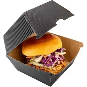


Burger Boxes by Color

Black, brown, pink, red and white burger boxes, printed to match your brand. The base board and the ink both shape the final color, so this range explains which combinations print true and which need a Pantone match. Free proofs show the color before anything goes to press.

Showing all 5 results

  • Black Burger Boxes
  • Brown Burger Boxes
  • Pink Burger Boxes
  • Red Burger Boxes
  • White Burger Boxes
  • How to Choose a Burger Box Color

    Color comes from the board or from the ink

    There are two ways to get a colored burger box. Natural brown is the kraft board itself, with no ink. Every other color is printed as a flood coat onto white SBS board, which is why white is the baseline for bright branding. A flood coat gives you any CMYK or Pantone shade across the whole box. For a clean canvas that takes any logo, white boxes for full-color branding are the simplest build and the easiest to proof accurately.

    Color choices compared

    ColorHow it is madeWorks best with
    WhiteCoated SBS paperboardPhotography, fine logos, multi-color prints
    BrownNatural kraft or recycled kraftOne-color logos, rustic or farm-to-table menus
    BlackFlood coat on white boardFoil, spot UV, premium positioning
    RedPantone flood coatHigh-visibility counters, bold brands
    PinkPantone flood coatDessert-style burgers, seasonal campaigns

    Black hides grease marks better than any other option and makes metallic foil read clearly. If your brand sits at the higher end of the menu, black boxes with foil or spot UV are the usual pairing. Pink and red need a matte finish to avoid looking plasticky under restaurant lighting.

    What a color adds to the quote

    Natural kraft is the cheapest because there is no flood coat. White costs slightly more for the board. A flood color adds ink coverage, and a Pantone match adds a mixed ink rather than a CMYK build. None of this triggers a plate or die charge. The finish is the bigger variable: gloss, matte, soft-touch or spot UV each change the look of the same color, and our guide to gloss, matte and spot UV finishes shows how each one behaves on dark and light boards.

    Mistakes to avoid

    • Approving a color on screen only. Monitors run brighter than ink, so ask for a sample before the full run.
    • Printing a dark logo on brown kraft and expecting contrast. Brown kraft boxes with one-color print look best with black or white ink, not navy or burgundy.
    • Choosing red for a delivery box. Red shows grease spots faster than black or kraft.
    • Mixing a flood-coated box with unprinted liners and cups. Match the set or keep the whole thing plain.

    Design Your Custom Color Burger Boxes

    Not sure which one to pick? Start with a box from this range, set your size, board and print, add your logo, and get a free quote with a digital proof.

    Choose your box, size, board, printing, finish and quantity, add your logo, and send it for a free quote. If this section does not load, request your free quote here.

Frequently Asked Questions

How do you match my exact brand color on a burger box?

Send the Pantone reference if you have one, because Pantone spot inks give the most consistent match from run to run. If you only have CMYK or hex values, we convert them and show the result on a free proof. Screens display color differently from printed board, so for a critical brand color, ask for a physical sample before approving the full run.

Should I use Pantone or CMYK when printing on kraft board?

Brown kraft absorbs ink and shifts every color warmer and darker. CMYK prints on kraft often look muddy, especially pale tones. Pantone spot inks, chosen with the brown base in mind, hold color better and suit one- or two-color logos. If your design relies on light or bright colors, white SBS board is usually the better base. Any color likely to fade on brown board is flagged at the proof stage.

How are black burger boxes printed so the design does not disappear?

Black boxes are usually made by printing a full black flood over white board, then adding the design in contrasting colors or finishes. Foil, spot UV and embossing stand out well on black, because they catch light rather than relying on ink. Fine text in dark colors will vanish, so keep logos in white, metallic or bright accents. Matte black with gloss spot UV is a popular pairing.

Will a dark color flood crack or show white at the folds?

Heavy ink coverage can show white board at sharp folds, especially with black, red or navy. A matte or soft-touch finish helps protect the surface, and placing fold lines in lighter areas of the design reduces visible cracking. Fold positions are reviewed on the dieline before printing, and small layout changes are suggested if a dark flood crosses a score line.

Are pink burger boxes printed or made from colored board?

Pink boxes are printed. We start with white SBS or kraft board and print the pink as a flood color, which lets us match any shade from pale blush to hot pink. On white board the pink stays clean and bright, while on kraft it reads as a dusty, muted tone. Pink boxes are popular with dessert burgers, bakery brands and Valentine's promotions.

Which shade of red works best for a fast-food look?

Bright, warm reds read as fast and appetizing, while deeper burgundy reds feel more like a premium grill. Red is one of the hardest colors to match in CMYK, so we recommend a Pantone red for consistency across reorders. Pair it with white or yellow type for legibility at a distance. Your free proof shows the red on the actual board you choose.

Is a plain brown kraft box enough, or should I add color?

A plain kraft box with a single-color logo is one of the most cost-effective ways to brand packaging, and the natural brown suggests a simple, earthy product. Adding one accent color often lifts the look without a big jump in cost. Full-color designs on kraft are possible, but every color will look warmer and softer than it would on white board.

Does a white box show grease stains more than darker colors?

Yes. Grease shows most on white and pale boxes, and least on black, dark red and brown kraft. If you want a white design, choose a grease-resistant food-grade lining, which stops oil from wicking through to the printed outside. For heavy, saucy menus, some brands print a darker pattern inside the box and keep the outside light, so both surfaces stay presentable.

Does adding more ink colors raise the price of a burger box?

Print coverage and the number of spot colors are part of the price, along with size, material, finish and quantity. Prices start from $0.20 per unit with a 100-unit minimum, and there are no plate charges for adding colors. Full CMYK and simple one-color designs are both common, so the easiest comparison is two quotes with different color counts.

How do gloss and matte finishes change the way a color looks?

Gloss makes colors look richer and more saturated, which suits bright reds and pinks. Matte softens colors slightly and cuts glare, giving black and dark tones a modern feel. Soft-touch adds a velvety texture on top of a matte look. Our guide to gloss, matte or spot UV finishes shows how each finish affects color and grip.

Get a Free Quote on Burger Boxes by Color

Tell us the size, style and quantity you need and we will come back with wholesale pricing and a production timeline. Free design and free shipping on every order.

  • Custom sizes and styles, made to your dimensions
  • Gloss, matte and spot UV finishes
  • Free design service and free shipping

Prefer to talk it through? Call (503) 461-4788.